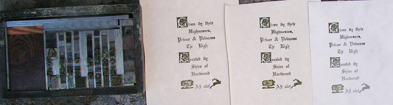
Explanation of project:
I recently joined the local SCA group, which is the Shire of Hartwood. This particular project was to make frontpieces to go into a set of 100 hand-bound books being given to their "highnesses" by the shire to serve as "largesse" - gifts presented to others by the "royalty". Hence the size, style and wording...
I printed 115 copies. They are certainly far from perfect, but for a first attempt, I'm
ridiculously proud of them. They are at least (mostly) legible.
Please note: the printing is not crooked...the photography is. Also, the books are
different sizes so the frontpieces will be cut to fit each book. I cropped the images.
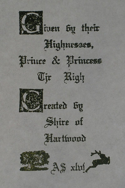
The font is 18 point Wedding Text. The initials
are a set purchased from Don Black Linecasting in
Toronto and the cuts - a hart and a wood - are
from a 'retired' print shop in Vancouver's Chinatown.
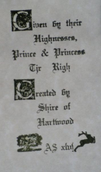
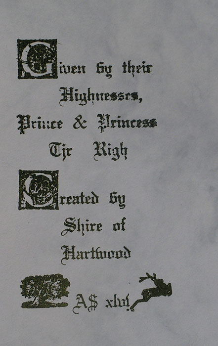
Oops!! One mistake I did make was reversing the
symbols I had for Hartwood. I should have put the leaping
stag on the left and the wood on the right. I realized it
partway through the press run but decided it added ... um ...
additional colour and interest. (That's my story and I'm
sticking to it.)
Paper is some stuff I had around - nothing special although
it looks appropriate for the purpose
- and the
ink is dark
green offset ink.